
Gestalt Design Principles · Part III of VII
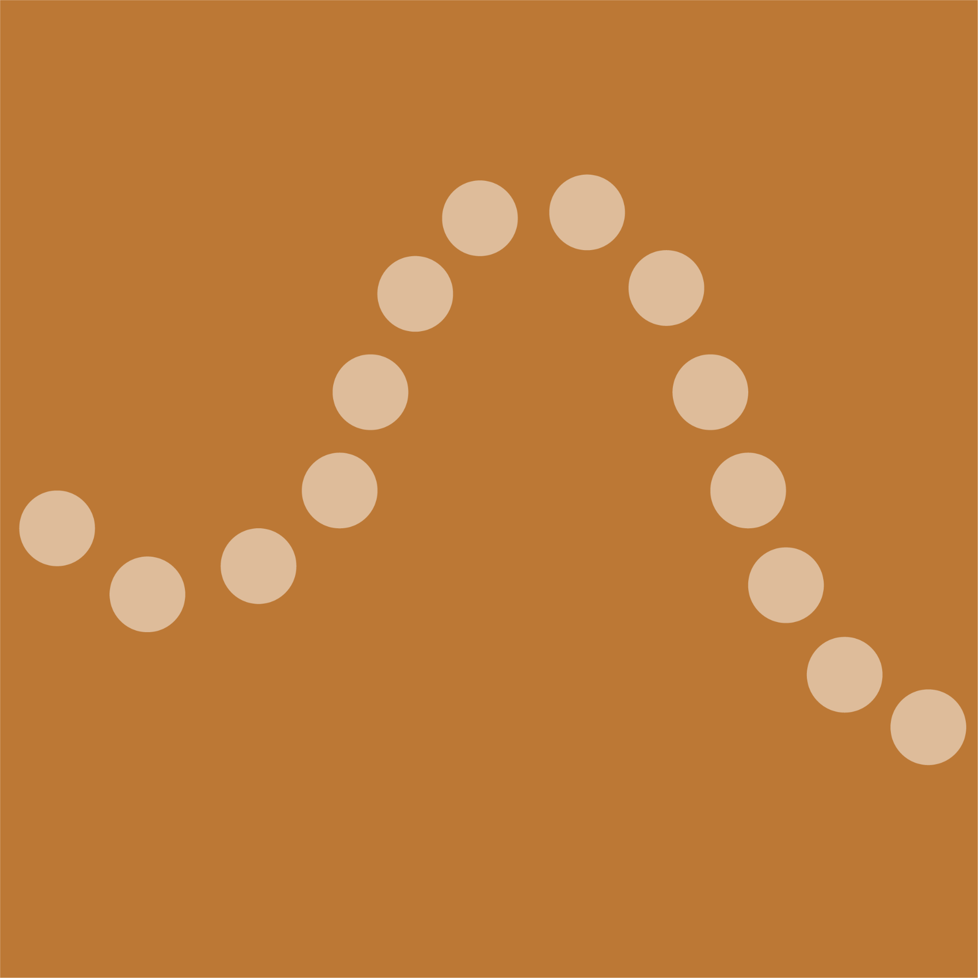
Proximity groups by space. Similarity groups by appearance. Continuity groups by direction. The eye, when it encounters a line or curve, has a powerful urge to follow it, to extend it beyond where it actually ends, to find the smoothest possible path through any arrangement of elements.
This isn't a metaphor. Your visual system literally extrapolates. When you see dots arranged in a gentle arc, you don't consciously decide they form a curve, the perception of the arc arrives before any deliberate thought. The brain predicts the path and fills in the gaps automatically.
"The eye is not a camera. It is a prediction machine, and it always bets on the smoothest path."
Wertheimer's original demonstrations showed this with overlapping lines: two lines crossing at a point are never seen as four rays meeting, they are always seen as two continuous lines passing through each other. The smooth continuation wins, every time, over the abrupt change of direction. This is the law of good continuation: the path requiring the least angular change is the path the eye prefers to follow.
The psychology of paths
Why does the eye follow smooth paths? The likely answer is ecological. In the natural world, the edges of objects tend to be smooth, a branch, a shoreline, a predator moving through grass. An abrupt change of direction usually signals an interruption: two separate objects whose edges happen to align, not one continuous thing. Evolution tuned the visual system to find continuous contours efficiently, because continuous contours usually mean single objects worth tracking.
In interface design, this means any arrangement of elements that implies a line or path will be perceived as a guided route. Alignment creates invisible rails. Repeated visual rhythms create flow. And broken paths create confusion, a sense that something is missing, that the route has ended unexpectedly.
The path completion demo
Drag the slider to introduce a gap, observe when the perceived path breaks
No gap, the eye reads one smooth, continuous path from left to right
Notice that the path continues to feel coherent well beyond a visible gap, the brain bridges interruptions readily, as long as the implied direction is consistent. Only at larger gaps does the path start to fracture into separate segments. This bridging capacity is what makes dashed lines, dotted separators, and interrupted connectors work in interface design. The eye does the joining.
Continuity as layout logic
Understanding continuity changes how you think about alignment. Alignment isn't a tidiness preference, it is the act of creating invisible guide rails that direct the eye. Every column of left-aligned text creates a vertical line down its left edge. Every row of cards creates a horizontal sweep. These implied lines are as real to the visual system as drawn lines, and they carry the eye just as forcefully.
This means misalignment is never neutral. A single element that breaks out of an established grid doesn't just look untidy, it interrupts a path the eye was already following, creating a small jolt of friction. Sometimes this is intentional: a call-to-action deliberately breaking the grid to capture attention. But most of the time it's accidental, and the user experiences it as low-level discomfort without knowing why.
Alignment rails, how invisible lines guide the eye
Toggle alignment, feel how the eye moves differently across the two layouts
Aligned, the eye glides down the left edge as a single continuous path
Continuity in UI patterns
The law of continuity is the invisible logic behind some of the most common and most effective UI patterns in web and mobile design. Once you see it, you cannot unsee it.
Progress indicators, continuity as orientation
A progress stepper works because it creates a continuous horizontal path from start to completion. The user's current position isn't just a label, it's a point on a journey the eye can follow forward and back. The line connecting the steps is not decoration: it is the path itself, and its continuity is what gives the user a sense of where they are and how far they have to go.
Click the steps, observe how continuity communicates progress and position
Step 2 of 4, the continuous line shows the journey; your position on it is unambiguous
Carousels and horizontal scroll, continuity implies more content
One of the most powerful applications of continuity in mobile design is the peeking card: a carousel where the next card is partially visible at the edge of the screen. The incomplete card creates an implied continuation, the eye sees the beginning of a path that extends beyond the viewport, and the brain immediately infers that more content exists in that direction. No "see more" label required. The truncation does the work.
The peeking card, partial visibility implies continuation beyond the edge
The partially visible card at the right edge creates a path that implies continuation, the eye follows it beyond the frame
Horizontal flow, guiding the eye through a process
Horizontal scrolling content, breadcrumbs, pipeline views, and timeline components all rely on continuity to communicate sequence. The eye reads left-to-right as "earlier to later," and any unbroken horizontal flow reinforces this. The visual logic of the path is the logic of the sequence, you understand the order before you've read a word.
A build pipeline, continuity communicates sequence and direction without labels
Breaking continuity intentionally
Everything said so far might suggest that continuity should always be preserved. The opposite is also true: a deliberate break in continuity is one of the most powerful ways to create emphasis. The eye follows paths so reliably that any interruption becomes immediately salient, it demands attention without any other visual treatment.
This is the logic of the asymmetric layout, the oversized hero element, the card that extends beyond the grid. These are not mistakes. They are conscious violations of the continuity the user's eye was already tracking, and because the eye was tracking it, the violation is impossible to ignore.
Intentional vs accidental interruption
The designer's checklist
1. Find your implied lines. Look at every layout at arm's length and identify the invisible paths: the left edges of text columns, the baselines of cards, the tops of icons. Are they consistent? Do they form unbroken rails? If two elements share a logical relationship, they should share an alignment.
2. Audit your accidental interruptions. Every element that sits 2–4px off a grid line creates a micro-interruption the eye detects even if the user cannot name it. If an element is almost aligned, align it fully or move it far enough away that no alignment is implied.
3. Use truncation as an affordance. Anywhere you have scrollable or swipeable content, carousels, horizontal lists, tab panels, ensure the last fully visible item is partially cut off. The incomplete element is a directional signal. Showing content that ends cleanly at an edge implies the content also ends there.
4. Earn your interruptions. Every deliberate break in continuity , a grid-breaking element, an oversized feature, a contrasting card, spends attention capital. Use interruptions to signal importance, not decoration. A layout with five intentional breaks has none.
More reading
The ADA Website Deadline Is Coming: What State and Local Agencies Need to Know
The DOJ Title II rule requires state and local government websites to meet WCAG 2.1 Level AA, with deadlines in April 2027 and April 2028. Here is what the rule covers, how to test, and a realistic path to compliance.
Nonprofit Websites That Build Trust & Drive Donations
What separates a nonprofit site that builds donor trust and quietly grows giving from one that drains staff time, plus the fundraising platforms actually worth using right now.